Your website font, color, and layout aren’t just design choices they’re the silent deal-makers (or deal-breakers) of your brand. In the first half-second someone lands on your site, these three elements speak louder than your copy, your offers, or your “About” page.
They set the mood, tell the story, and guide every click. Get them right, and your visitors instantly feel they’re in the right place. Get them wrong, and they’re gone before they even know what you do.
That moment lasts about 0.5 seconds. And no we’re not an exaggeration. That’s science. Pure undiluted web science.
In that split-second, what they see, your font, your colors, your layout, does all the talking. Not the copy on the page. Not your brand story. Not even your product.
Just the vibe, and if it feels confusing, chaotic, or outdated, then you’ve lost them already.
So let’s talk about how to choose the visual language of your brand, even if you’re not a designer, and especially if you’re building something meant to last.
Let’s clear something up before we dive in
A good design isn’t about being pretty, it’s about being clear. It has to be clear to the eye, clear to the mind, and most importantly, clear to the person on your site thinking,
“Can this brand help me or not?”
Because that’s really what it comes down to. And the clarity they’re looking for starts with three very human things:
- How your words look,
- how your brand feels, and
- how your content flows.
Or, in design terms: font, color, and layout.
Now, don’t worry, you don’t need to be a designer to get this right. But you do need to understand what each of these elements is doing.
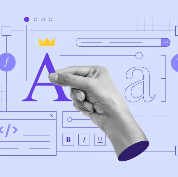
So, let’s start with fonts.
Fonts are funny. They seem small, but they carry a lot of weight.
Some fonts are loud. Some are soft. Some try too hard to be noticed and end up getting ignored. And every time someone visits your website, your font is speaking long before you do.
So here’s the question you need to ask when choosing one:
Does this font sound like my brand?
If you run a consultancy or a modern service-based business, a clean font like Lato or Poppins(these are the actual fonts) tells people, “I’m current. I’m professional. I know what I’m doing.”
If you’re in a more creative space, say, weddings, florals, or events, a gentle Serif or an elegant Script might say, “I care about beauty, details, and the experience.”
But here’s where people trip up, they mix five website fonts thinking it adds personality. It doesn’t. It just adds confusion.
Two fonts, max.
One for headlines. One for body text and you’re done.
That alone can make your site look 10x more professional, more readable, and yes, more trustworthy.
And trust us, you want trustworthy, that’s what converts visitors into clients.
Next we have color.
Have you ever walked into a room and felt something before you even know why?
That’s color doing its job.
Color sets the mood. It tells the story, triggers an emotion. And when it comes to your website, it’s one of the first things people notice (even if they don’t realize it).
So yes, choosing the right color matters alot. You have to think right. It’s not about “what looks good” or “what shade of green you like.” It’s about what that green says.
Soft pastels give off a gentle, calming energy. Great for wellness brands or anything rooted in care and ease.
Bold colors are more Loud and confident. Perfect for brands that want to be noticed, fast.
Muted tones are subtle, thoughtful, a little luxe. They say, “We’re intentional. We don’t need to shout.”
And then think of it like punctuation, fast, punchy, urgent.
Here’s a quick example:
If you’re a yoga instructor and your site’s full of bright reds and blacks, something feels off. That doesn’t say peace and balance, it says “emergency alert.”
Now flip it.
Imagine a fintech brand using pale lavender and beige. It might look nice, but does it inspire trust? Does it feel sharp and secure?
That’s the real question, how do you want someone to feel within the first five seconds of landing on your site?
Your color palette is the answer.
And please, for the love of readability, make sure your background doesn’t swallow your text. Accessibility isn’t a trend. It’s basic respect.
Now the Layout.
This is the part most people don’t think about and it’s also the part doing the most work.
Your layout is more than how things “look on the page.” It’s how people move through your site. It’s silent direction. Invisible guidance.
A good layout works like a great retail store:
You walk in, you know exactly where to look, what to do next, and how to leave with what you came for.
That’s how your website should feel.
If someone lands on your homepage and has to guess where to click next, you’ve lost them.
A strong layout does three things:
- It answers the question: What am I looking at?
- It leads the visitor to what they came for
- And it ends with a clear next step, Book Now, Learn More, Contact Us
If it feels chaotic or if everything’s fighting for attention, people will check out before they check out.
So, simplify and guide. Don’t try to impress. Just help people find their way.
One Last Thing: Design Is About Feeling, Not Just Features
The goal isn’t to make your site flashy. It’s to make it feel like you, and more importantly, feel right for the people you’re trying to reach.
If your brand is bold, your site should feel bold. If your work is thoughtful and refined, then the design should mirror that. If you’re warm, approachable, and professional, your layout, color, and typography should all support that tone.
When the design is done well, it doesn’t scream “Look at me!” It quietly tells the truth about who you are.
So if you’re staring at your website thinking, “Something’s off, but I can’t explain it”, you’re not alone. That “off” feeling usually comes from a lack of alignment.
Here’s a simple way to get back on track:
Don’t ask “Does it look good?”
Ask: “Does it feel right for my brand, and for the people I’m trying to serve?”
That’s the real starting point. Always.
If you’re serious about making the right impression, it pays to choose these elements with intention. Start by exploring Google Fonts or FontPair to find combinations that reflect your brand personality. Then, use Coolors or Adobe Color to build a color palette that resonates with your audience while staying accessible.
Finally, study Nielsen Norman Group’s layout best practices to make sure every page flows naturally. By combining these three elements with purpose, you’ll create a site that not only looks good, but works hard to keep visitors engaged.
If you’re not sure your website feels like your brand, we can help with that. We build websites that don’t just look good, they get you.
The fonts, the colors, the layout all work together to tell your story clearly, confidently, and in a way your audience actually connects with.
Book a free consultation today at digitalweavehq.com
#WebDesign #BrandStrategy #DesignThatWorks #WebsiteTips #SmallBusinessGrowth #LinkedInForFounders #UXDesign #CreativeDirection